v1.0
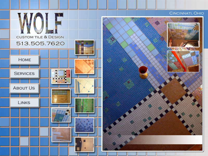
Wolf Custom Tile and Design is a kitchen and bathroom renovation business that focuses on artistic tile installations. Its website is a project I joined when the business was just getting off the ground in 2009. When the website was first launched, there was a limited number of works to display, and the owner, Rick Wolf, designed the site himself in Photoshop. Using his design, I cut the file up and made it into a working, static web site with the intention of launching a new, more dynamic site soon after.

v2.0
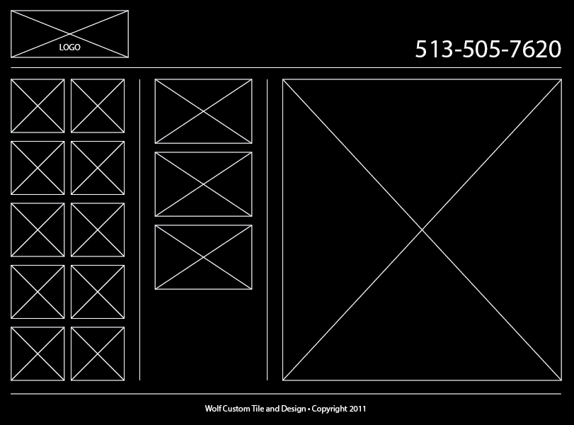
My intention for the second version of the site was to bring focus to the job photos by reducing visual clutter in the layout, make all job photos available rather than thumb nailing them into the hero images, and provide the visitor a means of easily navigating these jobs and their photos. By this time, the number of tile jobs Rick had completed had significantly increased, and the layout needed more structure to accommodate the maintenance of his growing portfolio. Drawing on the Column View of Mac OS Finder, I created a layout of three columns. As with the functionality of the Column View, the information displayed goes from general to specific, moving left to right across the columns. My thought here was to use a navigation and organization schema that most visitors would be familiar using. While this iteration of the site featured marked improvements, I knew the next version of the site would need to be dynamic in presentation and also have an administration section Rick could use to maintain the content himself.

v3.1
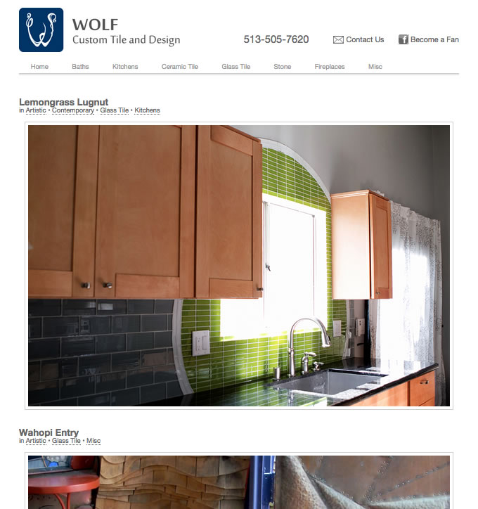
After some research and reflection on the growing business, Rick and I determined that showcasing the work in the style of a photography website was the best presentation. A new logo, larger images, and positioning of utility information in the header and footer were also added. The site was built in WordPress to allow Rick management of the content himself and also support an unlimited number of jobs. Moving to a photo blog layout also meant the site would need a global navigation to display the categorization of the jobs. The categorization was chosen based on job style (bath, kitchen, fireplace) or material (glass, ceramic, stone).

v3.2
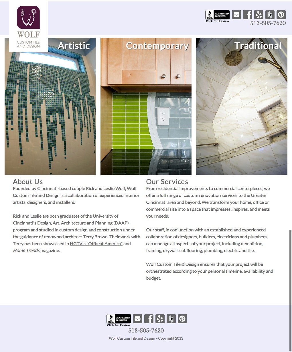
After living with the third iteration of the site for some time, we decided that the large image format was working well, but the site needed tweaking. Rather than jumping straight into the website’s body of work, Rick wanted a homepage that gave a quick but comprehensive glance at his portfolio. I then created a three-panel area showcasing each of the top-level categories. To best use the space, I coded each of the panels to loop through additional job photos in each category. In addition to the homepage enhancements, I also styled the site to be responsive down to mobile devices.
